Earphoria
Brand Identity & Style Guide — Concept Project
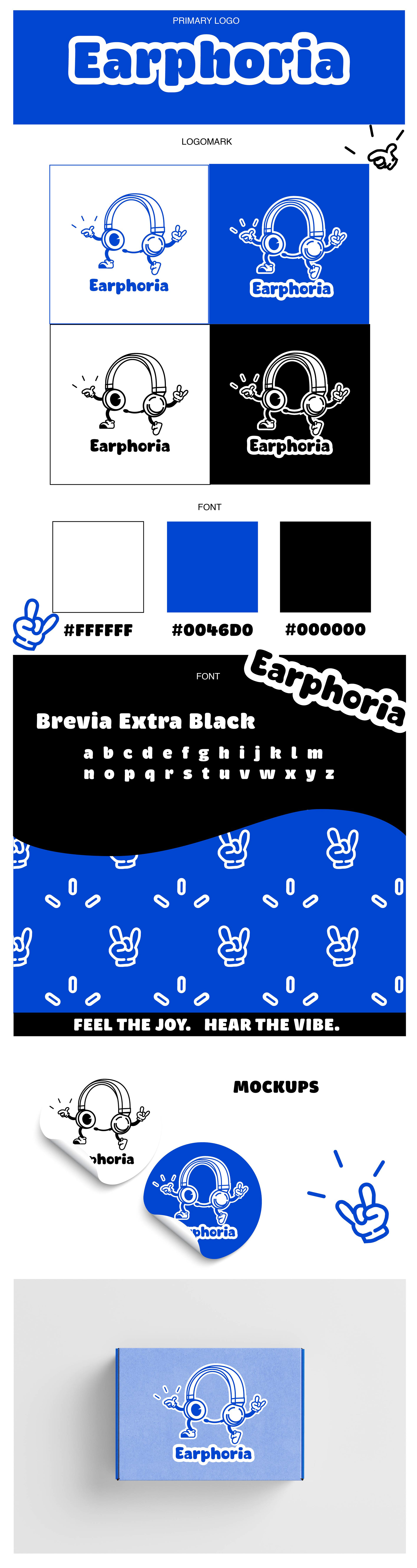
Overview
Earphoria is a playful, energetic headphone brand brought to life through a full logo and style guide. This project developed a visual system that reflects the brand’s joyful and immersive audio experience, aiming to feel bold, lively, and approachable across packaging, digital media, and marketing touchpoints.
Design & Visual Language
The logo features a cartoon-like headset character with a bold, hand-drawn style that radiates movement and joy. Typography, set in Brevia Extra Black, is rounded and approachable, complementing the youthful brand energy. A vibrant color palette of bright blue, crisp white, and black enhances the brand’s lively personality, while the style guide ensures consistent application across all brand touchpoints.
The design balances energy with clarity, creating a system that is playful yet structured enough to be flexible for digital, print, and product applications.
Outcome
The final system includes the logo, style guide, and color/typography specifications, demonstrating a cohesive and vibrant brand identity. This project highlights my ability to translate brand personality into a consistent visual language while considering real-world usability and scalability.